Monday, 12 July 2010


Monday, 5 July 2010
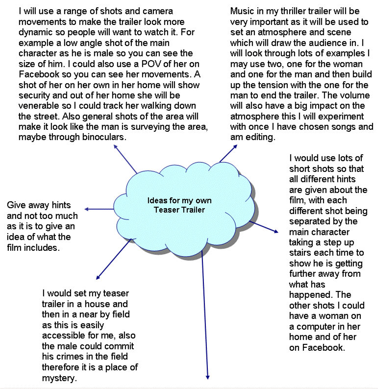
Magazine Front Cover for Film Magazines
Analysing Examples of magazine front covers which I can use to advertise my thriller film.

One of the main film magazines is Total Film, which advertises new films and stars, also information and advertising for the film. Most of the front covers like the one's shown below have a large image which shows the main characters in a film. They range from headshots to a longshot all of which make the film completly clear which is being advertised.They also like to cover some of the magazine title with the image this adds another dimesnsion to the page and it also look more professional, an example of this is in the Sherlock Holmes front page where he is looking directly into the camera as a figure of power, and on a shelf would gain eye contact and intrest the target audience. Also by the main characters being easily recognisable it will make people want to read a review and see what the film is like befire they watch it.
The title of the magazine is always situated at the top of the page with just enough room to fit a tagline above it. It is in white so it easily stands out on all backgrounds and by being short it can be larger as the word 'FILM' Is in bold and capitals in a sans serif font so it is simple and easy to read when spaning he full width of the magazine. The word 'TOTAL' is smaller inside the top part of the 'F'. It is in the same font as film and also in bold. The colour is a dark red so that it can be read inside 'FILM', The colour of this however does change dependant on the background of the cover and the type of film. The title therefore is easily recognisable and large so it can be clearly seen when on a shelf with lots of other magazines.
The backround behind the main image relates to the film and a setting which is seen behind, which all text is then placed on top of.
The rest of the space around the pictures is filled with text about the film and other information you can find inside the magazine. If the picture is a mid shot of a main character the information about the film is situated over the body of the actor/actress. All mainly include the title of the film in a large font and in bold so that it stands out. They are also in a different or bright colour from the other text . The other information in the magazine is displayed down both sides this shows that the magazine has a lot to offer. There will be a main, short word in a colour different from the main text for example blue, this will then relate to the black text below which elaborates sligtly in a smaller text in the title to make the reader want to read the magazine.
All of the covers have to feature a barcode this is genrally sideways and at the side of the magazine therefore not to distract from the content of the cover. Over all the balance between text and the main image makes the main film very clear and obvious, with the other content highlights still accesable to read for a person who may not like to read about the imediate film.

Another main film magazine is EMPIRE this is very well known for the the appearance especially of the title of the magazine as it is in a bright red colour so it stands out on most colour backgrounds which in this magazine are mainly darker especially at the top of the magazine. 'EMPIRE' is written in capitals in a sans serif font so that it is easy to read and by being the largest text on the page stands out. It is situated at the top of the magazine with room for a tag line above this is because if a magazine is on the shelf it is the top that people see so they will want to know what magazine they are buying.
The main images on the page are very similar to the 'Total Film' magazine as it is either a long shot or a mid shot of the main character in the film, so that the film is easily identifiable, also the characters are looking directly into the camera to draw in the reader. Some of the images are layered over the title of the magazine this makes the front cover look more 3 dimensional, and the title can still be read as it is so recognisable. The text on the empire pages is however different from total film as it is not the same or very similar in eah magazine. However as the backgrounds are mainly dark the text is usually in white. Main sub Headings are in capitals so they stand out in a font size of around 36 so large enough to easily read, this is important as it lets the reader know what else is included in the magazine. The smaller text and other details is in the same colour but in a smaller font as for a customer to read this they would have to pay closer attention.
Each of the Empire front covers is slightly different after the top quater after the title this is a strength of the cover as it is easily recognisable and however still adds variety by channginh the ratio of text on the cover and images dependant on the film, and the style of the rest of the page.


One of the main film magazines is Total Film, which advertises new films and stars, also information and advertising for the film. Most of the front covers like the one's shown below have a large image which shows the main characters in a film. They range from headshots to a longshot all of which make the film completly clear which is being advertised.They also like to cover some of the magazine title with the image this adds another dimesnsion to the page and it also look more professional, an example of this is in the Sherlock Holmes front page where he is looking directly into the camera as a figure of power, and on a shelf would gain eye contact and intrest the target audience. Also by the main characters being easily recognisable it will make people want to read a review and see what the film is like befire they watch it.
The title of the magazine is always situated at the top of the page with just enough room to fit a tagline above it. It is in white so it easily stands out on
 all backgrounds and by being short it can be larger as the word 'FILM' Is in bold and capitals in a sans serif font so it is simple and easy to read when spaning he full width of the magazine. The word 'TOTAL' is smaller inside the top part of the 'F'. It is in the same font as film and also in bold. The colour is a dark red so that it can be read inside 'FILM', The colour of this however does change dependant on the background of the cover and the type of film. The title therefore is easily recognisable and large so it can be clearly seen when on a shelf with lots of other magazines.
The backround behind the main image relates to the film and a setting which is seen behind, which all text is then placed on top of.
The rest of the space around the pictures is filled with text about the film and other information you can find inside the magazine. If the picture is a mid shot of a main character the information about the film is situated over the body of the actor/actress. All mainly include the title of the film in a large font and in bold so that it
 stands out. They are also in a different or bright colour from the other text . The other information in the magazine is displayed down both sides this shows that the magazine has a lot to offer. There will be a main, short word in a colour different from the main text for example blue, this will then relate to the black text below which elaborates sligtly in a smaller text in the title to make the reader want to read the magazine.
All of the covers have to feature a barcode this is genrally sideways and at the side of the magazine therefore not to distract from the content of the cover. Over all the balance between text and the main image makes the main film very clear and obvious, with the other content highlights still accesable to read for a person who may not like to read about the imediate film.

Another main film magazine is EMPIRE this is very well known for the the appearance especially of the title of the magazine as it is in a bright red colour so it stands out on most colour backgrounds which in this magazine are mainly darker especially at the top of the magazine. 'EMPIRE' is written in capitals in a sans serif font so that it is easy to read and by being the largest text on the page stands out. It is situated at the top of the magazine with room for a tag line above this is because if a magazine is on the shelf it is the top that people see so they will want to know what magazine they are buying.
The main images on the page are very similar to the 'Total Film' magazine as it is either a long shot or a mid shot of the main character in the
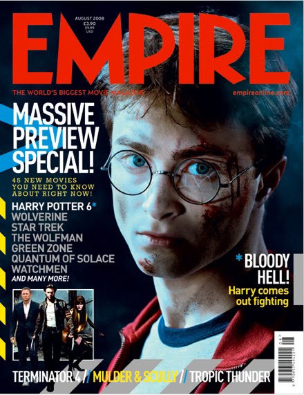 film, so that the film is easily identifiable, also the characters are looking directly into the camera to draw in the reader. Some of the images are layered over the title of the magazine this makes the front cover look more 3 dimensional, and the title can still be read as it is so recognisable. The text on the empire pages is however different from total film as it is not the same or very similar in eah magazine. However as the backgrounds are mainly dark the text is usually in white. Main sub Headings are in capitals so they stand out in a font size of around 36 so large enough to easily read, this is important as it lets the reader know what else is included in the magazine. The smaller text and other details is in the same colour but in a smaller font as for a customer to read this they would have to pay closer attention.
The covers add an extra image of something else in the magazine this shows versitility and that the magazine has other content rather than a review of one main film. Tag lines are of key importance to this magazine as when they are at the topof the page above the title they are commonly used as an introduction to the main article orif at the bottom to advertise other films. The magazine on the cover likes to show differnet type of film names so that the magazine is of best interest to everyone and not just someone who wants to read about the main review.
Each of the Empire front covers is slightly different after the top quater after the title this is a strength of the cover as it is easily recognisable and however still adds variety by channginh the ratio of text on the cover and images dependant on the film, and the style of the rest of the page.

Friday, 2 July 2010
What can my Crime Thriller be called?
Names
Envy- an emotion that occurs when a person lacks another's (perceived) superior quality, achievement, or possession and either desires it or wishes that the other lacked it.
Chase- If you have to catch someone in an act which is difficult, and that is what both the criminal does to women and the authoritys the killer.
Raw- Shows that the film is going be realistic and true without any messing around with an intense storyline
Innocence- Gives the impression that the women are vunerable and the criminal acts innocent.
Countdown- This will give a clear indication that time is a threat throughout the teaser trailer.
Control- this is what the man will have over the woman and can explain the relationship that the man wants with women.
Saturday, 26 June 2010
Poster for the Film
Another componant to my brief was to create a poster for the film.
 The Godfather Poster


Below I have looked at some examples of thriller film posters.
 The Godfather Poster
This poster is very simplistic, this is what makes the poster so effective. It features the main chaeracter the godfather who looks very suspicious, like you do not know what to expect. He is a figure of power which you can tell from the fact he is well groomed and smart in a suit but is very unpredictable. All of the dark colours show mystery, and in all the posters they have one specific main colour. The small text at the bottom give little information about people in the film however this is not significant as the main focus is the large image of the godfather which shows he is very important.
The title of the film is in whie to contrast with the black, this makes sure that it stands out. Puppet strings and a hand are used over the word 'godfather' this is a hint to what the film is about and connotates that the godfather can have control over people and influence there actions. The font it's self is in a serif font in a large size to make sure it is clear and readable as the aim of the poster is to get thbe target audience to see the name of the film. The text is in a posh style suggesting that the godfather may not abide by the law but acts like he is very upperclass as he has so much power and control. By the godfather's head being imposed over the words it helps to make him more defined as he is looking straight into the camera lense.

The Heat Poster
The Heat poster has a signature colour to the poster which is a copol blue colour suggesting that the characters in the film could be very mysterious and suspicious, also it creates a contrast to the name of the film heat. As people may think that the poster is ment to be in hot colours however the blue is a cool andcalm colour which is opposite to the film.
The Heat poster has a signature colour to the poster which is a copol blue colour suggesting that the characters in the film could be very mysterious and suspicious, also it creates a contrast to the name of the film heat. As people may think that the poster is ment to be in hot colours however the blue is a cool andcalm colour which is opposite to the film.
There is more text on this page than the 'godfather' as there are more main characters and that, the names are what they are going to use to sell the film, as people maty find it appealing to watch if there is a certain star actor/actress in the film. Therefore in a white font which is also a cool colour, and suggest innocence the names of 'Al Pacinio' and 'Robert Dinero' are at the top of the poster like a header so it is one of the first things that is seen. The size is quite large to make sure it is clear and easily readable, the sans serif font bold so that the information cannot be missed. Also the text is above a picture of the two stars so you also have a visual on who they are.
There is also a third character so they are all featured on the poster however as he is not as well known his name is smaller, but the font is kept the same and the colour this is too keep the poster consistant, as if it was a mixture it would look like the poster was just quickly put together without any thought being put into it. The picture of the two main characters heads looking opposite ways suggests that they are against eachother, however they are on a similar level which shows they are evenly matched. The images are in blue and black which matches the theme with the bottoms faded back into the background, this makes the poster look like one. The pictures are situated near the top of the page showing that they are both may be figures of authority within and out of the law as its a crime thriller. There are also smaller men which are below the main actors suggetsing that they are not as important and of a lower status maybe working for the main men.The title of the film is situated 3/4 of the way down the poster, in a larger font size so that the name of the film stands out which people will remember. The title has a red line underneath which symbolises the heat of the film and also danger or blood. It helps make the title stand ouy which is all in capitals in a white font, so all of the text is a similar colour.
The text at the bottom of the page is in the same font as on everyother poster which is small and here it is in a darker blue to keep with the blue theme, it gives details of directors and other people and distribution companys for the film.

The Kiss of Death Poster
The kiss of death poster uses a very similar layout as the Heat poster, taking up half of the page are the main two characters faces on the same level to show that they are equal, looking straight inot the camera to show intensity. The names of these characters and another are shown below in white so that they stand out on the brown colour scheme. The surnames are In capitals and larger so that they stand out in a slightly serif font to show that they are the highlight of the film. The title of the film again is 3/4 of the way down the page in all capitals and the largest font to make sure the name of the film is easily visible and stands out. The red colour which the name is written in makes it stand out as the rest of the poster is brown and also suggests blood and danger, that something bad will happen. The image of the streets in the bottom half of the picture shows where the film is going to be set and anything can happen on the streets, this image is also in the brown colour. By the two pictures being the same colour and faded into each other it makes the poster look more professional and all one image not lots of seperate componants. The text at the bottom of the page is in white which matches the actors names however it is in a typical font for details about the production and other information and is only small so that it does not distract from the main focus of the poster the picture and the title.

The Dark Blue Poster
The Dark Blue poster is only slightly different from the previous two posters, as I can see a pattern between the posers.This poster is landscape this make it look different and more individual from the other posters, whikst being similar enough so that the poster can be easily read and stands out to appeal to its target audience. The main colour scheme is a orangy brown and black. This contrasts with the name of the film being dark blue as the colour is not what you would expect. There are again two maiin characters featured on the poster in a similar colour to the background so thatthe picture looks professional and not disjointed. They take up about 3/4 of the page but are situated on the right leaving the left clear. As they re the main characters and also famous hey are used to entice people into wanting to watch the film, du to the staring actors, therefore only head shots are used. The text is in white 3/4 down the page like all of the others, this stands out on the dark brown/ black bottom, therefore it will stand out. It is very large so it can be easily read and in capitals, the font is sans serif with scratches through the top and bottom, suggesting that nothing is perfect. In a red they have placed tag lines for the film situated on the left above the title and also below these goive quated lines from the film, and a tag line to give a clue to what the film includes for the audience to interpret.

The Taking of Pelham 123 Poster#
The taking of pelham 123 poster is portrait like the majority of the previous posters, however the colour scheme is not stricly one it still has the dark elwement of black but focuses on blue and gold for the images of the main characters faces, this represents that they are on different sides and looking towards eachother thatb they could be enemies. The pictures are faded into the poster to make it look prodfessional and like one, they take up half of the page agauin to be a big focus so they target audience can easily see the stars in the film. There names are in between them at the neck in relation to the image, the surnames are in capitals in a size around 18 in bold so that they also stand out in white on the black background.
A variation in this poster is that the title of the film is half way up the page so another image is at the bottom. The text to inform the audience of the title of the film is in white to again stand out on the black. A simple sans serif font in bold capitals, this makes it clear and easy to read from a distance and easily. They have however put speed marks off the number and Pelham, this shows speed and relates to the train that is in the film. Below the title is a picture of the train in a tunnel and a silhouett of where the film is set, the rest of the picture mirrors the colours used for the main actors. This is good as it helps to give a hint of what is in the film. At the bottom of the poster it features all information about the director and distribution companies in the same text as all of the other posters in a gold colour which is not easy to read. On this occasion this is probably better so that it does not distract from the main pictures and title of the film.
Friday, 25 June 2010
Final Choice of Location and Pictures
I have decided that my teaser trailer is going to be set in the field out the back of my house as this is an easily accessible location. Also some of the clips will be filmed indoors. Images of my chosen location are shown below.


As you can see from the pictures I am mainly going to use the bridge, as you can get many shots from different angles. I will also use the house as in the dark, when a house light is turned on you can see what is happening in the picture as shown above. The sign is also significant as it shows that there are many directions that could be taken. The forest also shows a typical thriller location, the house is also a contrast. The house is bright and happy whereas the forset is dark and dull.


As you can see from the pictures I am mainly going to use the bridge, as you can get many shots from different angles. I will also use the house as in the dark, when a house light is turned on you can see what is happening in the picture as shown above. The sign is also significant as it shows that there are many directions that could be taken. The forest also shows a typical thriller location, the house is also a contrast. The house is bright and happy whereas the forset is dark and dull.
Locations for my Thriller
Locations


There are many different places a thriller can be set and as my main character is a cyber criminal who then meets with people rapes and then murders them some location will be more suitable than others.
I beleive that in an open field would be effective near a house in a corner. This would be mysterious as it is not on top of the house and place he may have sat at the computer and having a conversation with a young vunerable girl.


Another possible location could be the place that they meet up to place in the teaser trailer such as a bus stop, which then leads them down an alley in which anything can happen.

Down an alley would be a sterotypical location as it is a hidden location late at night in which most people will not go to, also a young girl may look vunerable and inoccent down a side street meeting up with an older man.


When selecting a location for my thriller film I have to be very aware of what is accesible, around me and what i can succesfully film. For example a field would be very easy as I am surrounded by them. Also a bus stop would not look as effective for my thriller as it is only a teaser trailer and also to get to the style of stop I would desire I would have to travel a long way. An alley however would also look very effective and I think that a combination of the two would work well as all all a teaser trailer does is provide the audience with hints.
Thursday, 24 June 2010
Mis-en- Scene for my Teaser Trailer
 Character/ Costume
In my Teaser Trailer, Magazine Front Cover and Poster it will feature two main characters. One of the characters is a young female girl. From the examples of thrillers I have looked at the girl is usually the innocent one. Therefore I have chosen for nay to wear light colors to show her innocence and vunerability. The images below show this.
After I have looked other examples the men are always very suspicious and menacing. Therefore Alex is in dark clothes and looks menacing like all of his actions are unpredictable. His costume consists of dark clothes, this is more mysterious to connotate a shady character.


Make-up
My main female character will just be wearing natural everyday makeup, as the trailer shows her in everyday life and therefore she should look natural, this makes the film look more realistic. The image shows how the actors makeup will look in the film.

Lighting
The choice of lighting is very important as I will be filming many different shots. In the house i will use the normal lights in the house, as they will be brighter shots, showing that everything is ok and calm. The shots outside because it is dusk I will use a powerful torch to help enhance shadows in shots and there clarity.
Sound
I have not yet decided what sound I am going to use so I will blog this separately later. However I do know that from the examples I have looked at I need to have a non- diagetic soundtrack which creates a tense atmosphere in anticipation for the whole film not just the teaser trailer.
Subscribe to:
Posts (Atom)