Thursday, 14 October 2010

Developing my Magazine Front Cover

To begin developing my magazine front cover, I will look at texts in different colours to say 'Watch Film' and different styles. I then proceeded to develop my poster until I was happy with the end result.
Process of making my poster:

Selecting the correct font in which to display my title was a very difficult descision. I have 5 options to choose from.


Out of the options and recieving feedback from other media students I have found that my favorite out of the texts is the second row on the right. This is very simple and the sans serif font is easy to read and will stand out on the front of a magazine cover. However I am unsure about the colour scheme of the title.


Image- When I began selecting an image I knew that I wanted one with both the main characters look towards the camera as this was a key aspect when I looked at other film magazine front covers. When I selected the image that I wanted to use on my front cover I had lots of trouble throughout editing the image. It was hard to get rid of the whole background so that I could place the image anywhere. Therefore I spent lots of time changing the contrast and colours.


Texts and Titles-


When I had chosen the image for my background I could then begin to experiment with colours and styles. I decided to add a tagline to the bottom of my magazine cover as this was seen in the examples I have looked at. Due to the title of the magazine being in red I then decided to continue this theme throughout with sub titles of what is in the magazine and the stars. This helped me to contuinue a theme throughout my poster. The title 'CONTROL' of the film in the only text in black so that ity is different from the other texts. I have placed the title in the serif font of 'times new roman' so that it is the same in my teaser trailer and poster this is deliberate continuity. I have placed a star rating on the front cover as it will demonstrate to the reader that the film is popular. For the other text on the front page I have used a 'Rockwell' font this is a serif font. This is in dark grey so that it stands out on the background but does not distract focus from the main image. I decided to add another small image on the front as the examples I have looked at all have an image of what is inside. I editied this so that you cannot see the background, also I have kept it small so it is noticable but dosent distract from the main image and film.

Complete Poster:


My complete poster I beleive looks very professional. I have choosen to use red as the accent colour as it stands out on the white/ grey background. By being a strong colour it will also draw peoples attention into wanting to look at the magazine front cover.

Sunday, 3 October 2010

Finding Music For the Trailer

Atmosphere is key when it comes to a thriller film wether it is the opening or the teaser trailer. The music for the teaser trailer must also build up anticipation for the film as it is what makes people want to watch the entire film. I set up a weekend of looking through CD's and trying to find a sutable track to then place on the storyboard. This however is very hard as you do not know how the track will fit with the shots, and match the thriller genre.

Monday, 27 September 2010

Developing My Poster

This is the image out of the ones I edited that I am going to use on my poster, this is because it gives a hint of the location. Also with there being an area of open space on the front it is a good place to place faces of the two main characters below their names.This will keep consistency by following a similar layout to the examples which I have analysed, so hopefully my poster will look professional. Now that I have chosen my main image for the front cover of my poster, I have kept it simple so that text easily stands out when placed in white on a dark colour which is most common in the examples I have seen. I began by placing the text of the main actors/ actresses names at the top of the page like I had seen in the examples I have analysed. I chose a sans serif text which looks destroyed and not complete, but still easy to read. When placed in white stood out on the black background. I have had difficulty in choosing a text to write 'CONTROL' in as it needed to stand out and still fit with the thriller genre. The options I have to choose from are shown below. As I am not sure which text looks best I have questioned people in my media class and outside to gain there opinion on the texts.I sent around a question in which I asked people to chose the text that they like the most and would look best on a poster for my thriller film. After analysing the results of the question i gave to my media class i found that the most popular text was the 5th option. I agree with this as it is simple however does look formal, also it is easy to read and stands out on the dark background. I also found that when you print the poster it comes out very dark, so when editing I have changed the brightness so that when printed the image clarity is improved and the tree lines are easily visable. Once the text has been selected I found that the smaller text to advertise the actors names did not fit in with the main font so I will try out different examples so that the poster flows and looks professional.I found a sans serif font which is easy to read and is similar to the main font. This is shown below: Next week I plan to take photos for the front of the poster on Wednesday. I will take them on a plain background so when I edit them and change the contrast it becomes easier. I plan to have the two main characters looking towards or away from eachother i will see what looks most effective when they are placed on the poster. Last week on the 20th of October I went and took differnt shots of Naomi who is the main character in the opening to the teaser trailer, these are shown below i used all different shots to see what would be the most effective. These will then be edited and the best one then selected. 
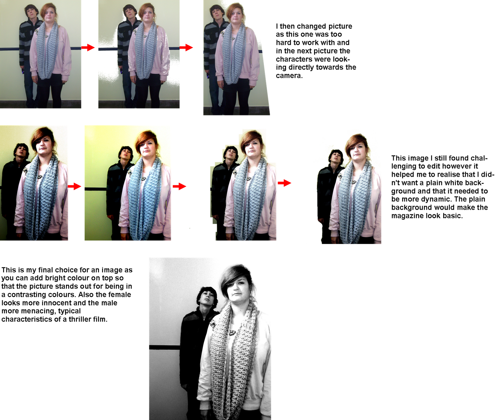
I was then going to take pictures of a male in half term however I was let down by the male I was going to use. Therefore when we came back to school I then asked Alex Mutu he said he would help. So on the 3rd November I took headshots at different angles. The close up's are the best for my poster. I also took pictures of Naomi and Alex for the front cover of my magazine, I got my inspiration from a cover by Total Film advertising King Kong. Finishing off the poster Images Colour scheme Editingn of Images Tag line Texts (sizes and styles) Overall

Wednesday, 22 September 2010

Edited Pictures of my Location

Friday 17th September I went out to my location and took some pictures to be used on the poster for my teaser trailer and to gain an idea of different shots and to get a better idea of how I am going to film my teaser trailer in the location. This was a good experience as I went at dusk therefore managing to get images that fit the time of day of my film. I have then edited these to give the pictures below.


I edited these and changed the contrast to make the pictures look darker as when they were originally the sun was bright and this was not the effect I wanted on my front cover, as the darkness adds an element of suprise.The first and last images are my favorite as they create an element of mystery as you do not know what is behind the shadows also there is enough blank space for me to place the faces of the main actors which I will blend into the background. I liked the effect of the shadows as they were dark white will stand out on top for the writing making it clear and easy to read.

Friday, 20 August 2010

Styles of Text's for Poster/Film Trailer

Below I have founs some texts which I will compare for the front of the poster for the film. This will be very important as a similar font will be used on the magazine and it will feature in the last frame in the teaser trailer. I will keep the text similar on the magazine and the same in the teaser trailer and poster because they will then relate to each other and form a whole package rather than all being seperate.


1. The text is like a destroyed font and not fully completed, this suggests that something is not as it seems and maybe that control can be broken. Also it is easy to read and clear by using capitals.

2. The second text is very similar to the first one in a serif font, however i prefer this one as it is moire compact and will show the tight control that the man has over women.

3.This is my least favorite of all the texts as it is very sharp and too harsh for my trailer which is more secritive. Also the point suggests a knife as a weapon and that does not relate to my trailer.

4. The fourth text is like it is written on computer keys and this ties in very well with my thriller and the text is in a sans serif font so it is easy to read. However i think this would give too much information out about my film and would not look as clear or fluent on a poster when i want it all to blend in and look professional.

The other texts I am not going to use my favorite of all the texts and the one I am going to use is the second font as this will look best on the teaser trailer and also it would look the most professional on a poster and film cover.

Thursday, 19 August 2010

What to Call The Magazine

I am going to call my film magazine 'Film Watch'. I believe that this is an effective name as this is the way that people view films and, wiwth the word film also featured it ensures that the reader/ customer knows what the magazine is about. I plan on my front cover to use a similr style to the Total Film covers as in my opinion these are most effective as they are all similar and keep a consostant layout so that the magazine is easily recognisable. This is not the same for the Empire magazine which after the title can vary a lot and sometimes have a large rtion of text to images which I think that the magazine does not always get correct. Therefore my cover is mainly going to be based around 'Total Film' magazine as I beleive it is the best layed out with the correct ratio of text to images and therefore my name for the magazine is two words like 'Total Film'.

Thursday, 12 August 2010

The Name of My Film

I have decided that I am going to call my teaser trailer for a film 'CONTROL' this is because it relates to what the main character in the film, and what the dominate male wants from women. Also the film is based around the vunrability of women and this is what they do not have, and how they can be manipulated by a male . Also I believe by the title of the film being one word, for a crime thriller it will easily grab peoples attention as most of the crime thrillers have short titles such as 'deep blue', 'the godfather' and 'heat'. They are all kept simple and thoughts about the film can be drawn from the name.