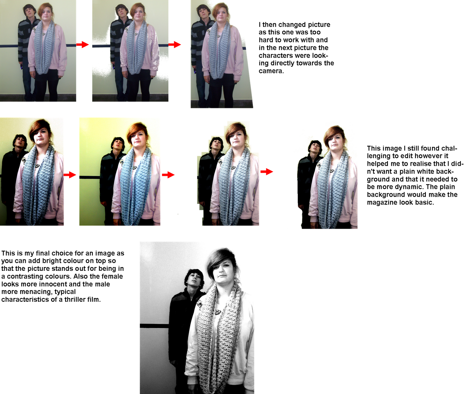
Process of making my poster:

Out of the options and recieving feedback from other media students I have found that my favorite out of the texts is the second row on the right. This is very simple and the sans serif font is easy to read and will stand out on the front of a magazine cover. However I am unsure about the colour scheme of the title.
Texts and Titles-
When I had chosen the image for my background I could then begin to experiment with colours and styles. I decided to add a tagline to the bottom of my magazine cover as this was seen in the examples I have looked at. Due to the title of the magazine being in red I then decided to continue this theme throughout with sub titles of what is in the magazine and the stars. This helped me to contuinue a theme throughout my poster. The title 'CONTROL' of the film in the only text in black so that ity is different from the other texts. I have placed the title in the serif font of 'times new roman' so that it is the same in my teaser trailer and poster this is deliberate continuity. I have placed a star rating on the front cover as it will demonstrate to the reader that the film is popular. For the other text on the front page I have used a 'Rockwell' font this is a serif font. This is in dark grey so that it stands out on the background but does not distract focus from the main image. I decided to add another small image on the front as the examples I have looked at all have an image of what is inside. I editied this so that you cannot see the background, also I have kept it small so it is noticable but dosent distract from the main image and film.
Complete Poster: 
No comments:
Post a Comment