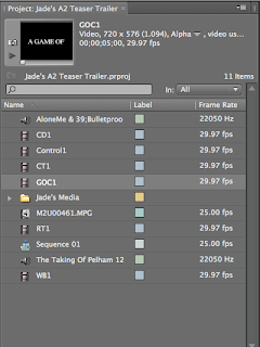
The first print screen shows the location where you drag clips and titles from when you are on adobe premier pro. The ones with the speaker show the music that I have decoded to use or experiment with on my teaser trailer. The ones with film clips besides them are all of the titles I have used in my teaser trailer, these were a main focus when I looked at examples of teaser trailers. I have created my own folder on the mac so it is easier to access all of my own footage.
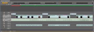
This shot shot shows the sequence of events in my teaser trailer. In the top row are my titles. In my trailer I wanted these on a black background as these stand out and are easier to read. The next video row shows my footage and the transitions I have used. I enjoyed experimenting with these the most common ones I used were different types of fades. In the first Audio row I have clicked and dragged the music into the column, I have placed it correctly to line it up with the film. Then at the end have added a fade so that the teaser trailer ends with the 'control' title. The music sounds better faded out if not it ends to harsh which sounds unprofessional.
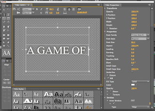
This shot shows one of my titles. I found it hard to finally chose a suitable font to use looking through both serif and sans serif font. In the end I decided to use 'times new roman' for all of my titles. I decided this as it matched with the font I had written control in on one of my auxiliary tasks the poster and also for the word control on the magazine cover. By doing this I believe it makes my tasks look more like a whole promotional package for a teaser trailer. I knew that I wanted to use a black background and then to have white text as this was a common convention in the examples I had looked at. Also because the colours contrast each other they are easy to read from a distance. I then experimented with different glow effects, I added a small one to my titles as this looked more professional and added a mysterious effect. I repeated this for the rest of my titles. The title shown in the print screen shows 'a game of' this links onto the next slide therefore I was debating about whether to put full stops at the end of it.
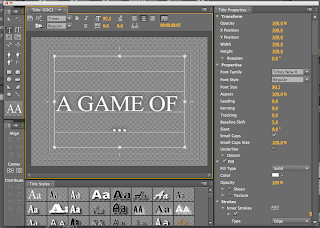
This shot shows the title with dots however I believe that this does not look very effective and by being on a separate line makes the title look unprofessional therefore I went back to the original title and placed this onto my actual teaser trailer.
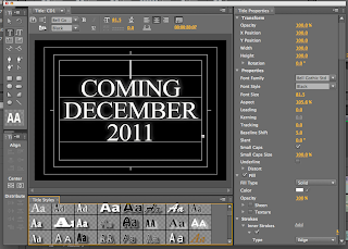
This screen shot shows a complete title where the subtle glow adds a element of shadow and mystery and the white stands out on the black.
Editing has therefore been very succesful and my teaser trailer is nearly complete.
No comments:
Post a Comment