Monday, 12 July 2010


Monday, 5 July 2010
Magazine Front Cover for Film Magazines
Analysing Examples of magazine front covers which I can use to advertise my thriller film.

One of the main film magazines is Total Film, which advertises new films and stars, also information and advertising for the film. Most of the front covers like the one's shown below have a large image which shows the main characters in a film. They range from headshots to a longshot all of which make the film completly clear which is being advertised.They also like to cover some of the magazine title with the image this adds another dimesnsion to the page and it also look more professional, an example of this is in the Sherlock Holmes front page where he is looking directly into the camera as a figure of power, and on a shelf would gain eye contact and intrest the target audience. Also by the main characters being easily recognisable it will make people want to read a review and see what the film is like befire they watch it.
The title of the magazine is always situated at the top of the page with just enough room to fit a tagline above it. It is in white so it easily stands out on all backgrounds and by being short it can be larger as the word 'FILM' Is in bold and capitals in a sans serif font so it is simple and easy to read when spaning he full width of the magazine. The word 'TOTAL' is smaller inside the top part of the 'F'. It is in the same font as film and also in bold. The colour is a dark red so that it can be read inside 'FILM', The colour of this however does change dependant on the background of the cover and the type of film. The title therefore is easily recognisable and large so it can be clearly seen when on a shelf with lots of other magazines.
The backround behind the main image relates to the film and a setting which is seen behind, which all text is then placed on top of.
The rest of the space around the pictures is filled with text about the film and other information you can find inside the magazine. If the picture is a mid shot of a main character the information about the film is situated over the body of the actor/actress. All mainly include the title of the film in a large font and in bold so that it stands out. They are also in a different or bright colour from the other text . The other information in the magazine is displayed down both sides this shows that the magazine has a lot to offer. There will be a main, short word in a colour different from the main text for example blue, this will then relate to the black text below which elaborates sligtly in a smaller text in the title to make the reader want to read the magazine.
All of the covers have to feature a barcode this is genrally sideways and at the side of the magazine therefore not to distract from the content of the cover. Over all the balance between text and the main image makes the main film very clear and obvious, with the other content highlights still accesable to read for a person who may not like to read about the imediate film.

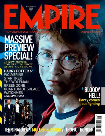
Another main film magazine is EMPIRE this is very well known for the the appearance especially of the title of the magazine as it is in a bright red colour so it stands out on most colour backgrounds which in this magazine are mainly darker especially at the top of the magazine. 'EMPIRE' is written in capitals in a sans serif font so that it is easy to read and by being the largest text on the page stands out. It is situated at the top of the magazine with room for a tag line above this is because if a magazine is on the shelf it is the top that people see so they will want to know what magazine they are buying.
The main images on the page are very similar to the 'Total Film' magazine as it is either a long shot or a mid shot of the main character in the film, so that the film is easily identifiable, also the characters are looking directly into the camera to draw in the reader. Some of the images are layered over the title of the magazine this makes the front cover look more 3 dimensional, and the title can still be read as it is so recognisable. The text on the empire pages is however different from total film as it is not the same or very similar in eah magazine. However as the backgrounds are mainly dark the text is usually in white. Main sub Headings are in capitals so they stand out in a font size of around 36 so large enough to easily read, this is important as it lets the reader know what else is included in the magazine. The smaller text and other details is in the same colour but in a smaller font as for a customer to read this they would have to pay closer attention.
Each of the Empire front covers is slightly different after the top quater after the title this is a strength of the cover as it is easily recognisable and however still adds variety by channginh the ratio of text on the cover and images dependant on the film, and the style of the rest of the page.


One of the main film magazines is Total Film, which advertises new films and stars, also information and advertising for the film. Most of the front covers like the one's shown below have a large image which shows the main characters in a film. They range from headshots to a longshot all of which make the film completly clear which is being advertised.They also like to cover some of the magazine title with the image this adds another dimesnsion to the page and it also look more professional, an example of this is in the Sherlock Holmes front page where he is looking directly into the camera as a figure of power, and on a shelf would gain eye contact and intrest the target audience. Also by the main characters being easily recognisable it will make people want to read a review and see what the film is like befire they watch it.
The title of the magazine is always situated at the top of the page with just enough room to fit a tagline above it. It is in white so it easily stands out on
 all backgrounds and by being short it can be larger as the word 'FILM' Is in bold and capitals in a sans serif font so it is simple and easy to read when spaning he full width of the magazine. The word 'TOTAL' is smaller inside the top part of the 'F'. It is in the same font as film and also in bold. The colour is a dark red so that it can be read inside 'FILM', The colour of this however does change dependant on the background of the cover and the type of film. The title therefore is easily recognisable and large so it can be clearly seen when on a shelf with lots of other magazines.
The backround behind the main image relates to the film and a setting which is seen behind, which all text is then placed on top of.
The rest of the space around the pictures is filled with text about the film and other information you can find inside the magazine. If the picture is a mid shot of a main character the information about the film is situated over the body of the actor/actress. All mainly include the title of the film in a large font and in bold so that it
 stands out. They are also in a different or bright colour from the other text . The other information in the magazine is displayed down both sides this shows that the magazine has a lot to offer. There will be a main, short word in a colour different from the main text for example blue, this will then relate to the black text below which elaborates sligtly in a smaller text in the title to make the reader want to read the magazine.
All of the covers have to feature a barcode this is genrally sideways and at the side of the magazine therefore not to distract from the content of the cover. Over all the balance between text and the main image makes the main film very clear and obvious, with the other content highlights still accesable to read for a person who may not like to read about the imediate film.

Another main film magazine is EMPIRE this is very well known for the the appearance especially of the title of the magazine as it is in a bright red colour so it stands out on most colour backgrounds which in this magazine are mainly darker especially at the top of the magazine. 'EMPIRE' is written in capitals in a sans serif font so that it is easy to read and by being the largest text on the page stands out. It is situated at the top of the magazine with room for a tag line above this is because if a magazine is on the shelf it is the top that people see so they will want to know what magazine they are buying.
The main images on the page are very similar to the 'Total Film' magazine as it is either a long shot or a mid shot of the main character in the
 film, so that the film is easily identifiable, also the characters are looking directly into the camera to draw in the reader. Some of the images are layered over the title of the magazine this makes the front cover look more 3 dimensional, and the title can still be read as it is so recognisable. The text on the empire pages is however different from total film as it is not the same or very similar in eah magazine. However as the backgrounds are mainly dark the text is usually in white. Main sub Headings are in capitals so they stand out in a font size of around 36 so large enough to easily read, this is important as it lets the reader know what else is included in the magazine. The smaller text and other details is in the same colour but in a smaller font as for a customer to read this they would have to pay closer attention.
The covers add an extra image of something else in the magazine this shows versitility and that the magazine has other content rather than a review of one main film. Tag lines are of key importance to this magazine as when they are at the topof the page above the title they are commonly used as an introduction to the main article orif at the bottom to advertise other films. The magazine on the cover likes to show differnet type of film names so that the magazine is of best interest to everyone and not just someone who wants to read about the main review.
Each of the Empire front covers is slightly different after the top quater after the title this is a strength of the cover as it is easily recognisable and however still adds variety by channginh the ratio of text on the cover and images dependant on the film, and the style of the rest of the page.

Friday, 2 July 2010
What can my Crime Thriller be called?
Names
Envy- an emotion that occurs when a person lacks another's (perceived) superior quality, achievement, or possession and either desires it or wishes that the other lacked it.
Chase- If you have to catch someone in an act which is difficult, and that is what both the criminal does to women and the authoritys the killer.
Raw- Shows that the film is going be realistic and true without any messing around with an intense storyline
Innocence- Gives the impression that the women are vunerable and the criminal acts innocent.
Countdown- This will give a clear indication that time is a threat throughout the teaser trailer.
Control- this is what the man will have over the woman and can explain the relationship that the man wants with women.
Subscribe to:
Comments (Atom)